Climate change is the greatest menace in history of mankind. In 2020, »Der Spiegel« dedicated an entire issue to this global threat. As part of this project, I designed, researched and produced a series of four large infographic pages. The focus was not only on conveying the information, but also on the design. This was because we intended this number as a test case for »Der Spiegel«’s new print layout, and as a prototype for the new visual standard for infographics.
The concept evolved from the motif ‘Fire, water, earth, air – the four elements spiral out of balance’. Thus, one graphic focuses on forest fires, another on Arctic sea ice, a third on drought, and a fourth on air pollution.
The process
All pages are based on a data analysis that I conducted for this project. I used Python for the data preparation and the necessary calculations. I plotted most of the charts using the Python libraries Matplotlib and Altair. Furthermore, I used QGIS to build the maps and Adobe Illustrator to polish and compose the pages.
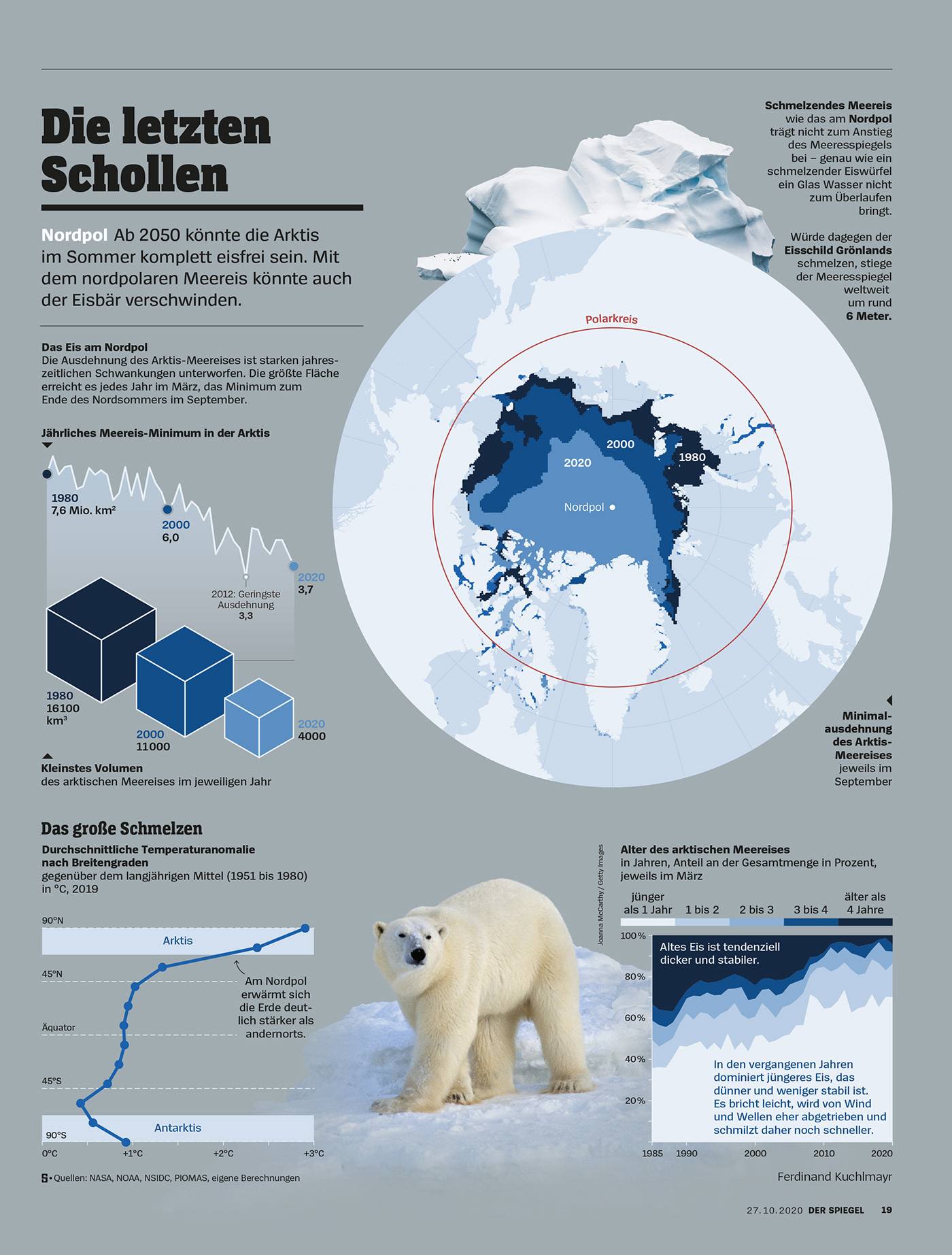
I: Arctic sea ice
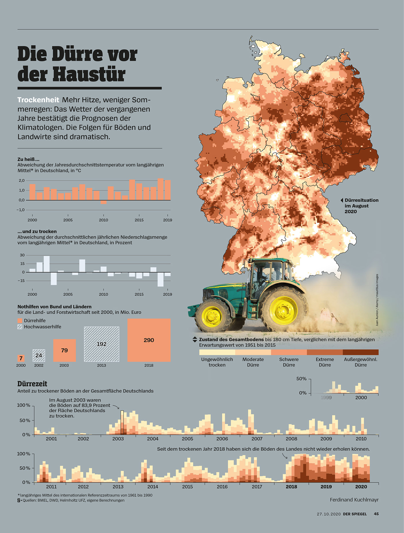
II: Drought in Germany
For this chart, I aggregated data from the Helmholtz UFZ’s German Drought Monitor. I was particularly impressed by the bottom chart showing the large share of Germany’s soil being affected by drought in the years following 2018.
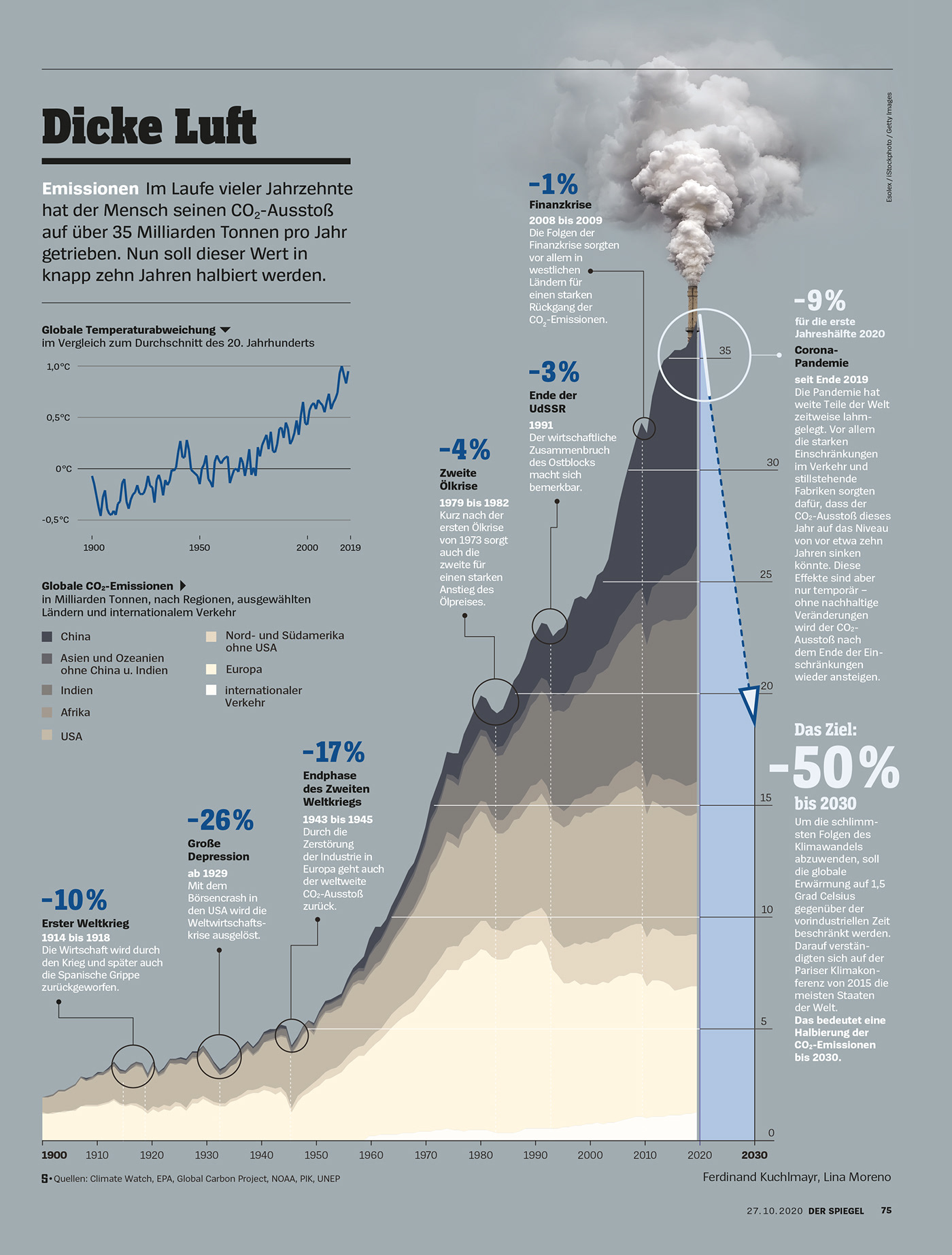
III: Air pollution
This graphic was produced by my former colleague Lina Moreno.
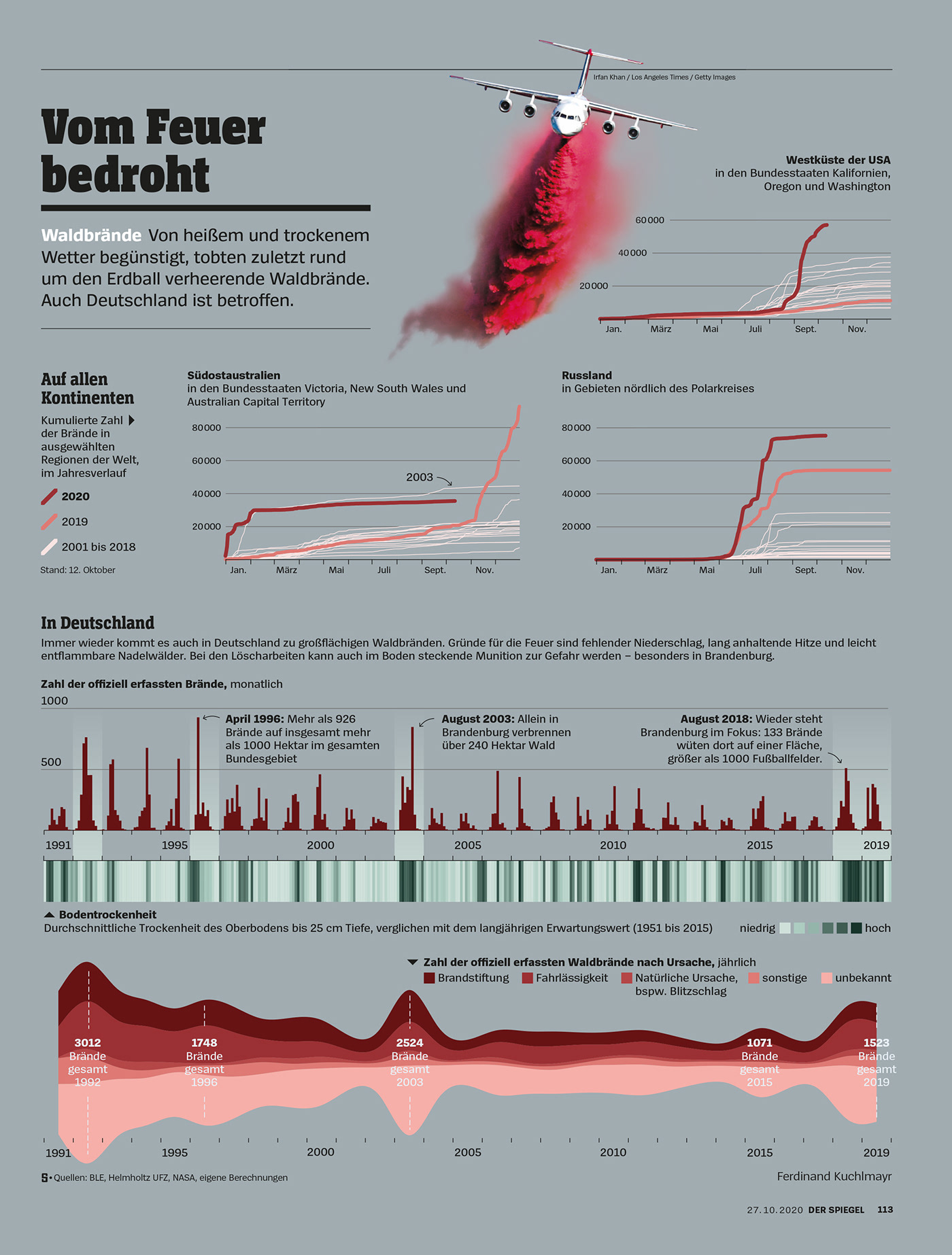
IV: Wildfires
The years 2019 and 2020 marked devastating wildfire seasons in some regions. To clarify the dimensions, I wanted to compare these years with the previous seasons. I calculated the global wildfire charts based on data obtained via NASA’s Fire Information for Resource Management System (FIRMS). The bottom section focuses on the situation in Germany. It correlates the number of fires with soil drought and lies out the reasons for wildfires.