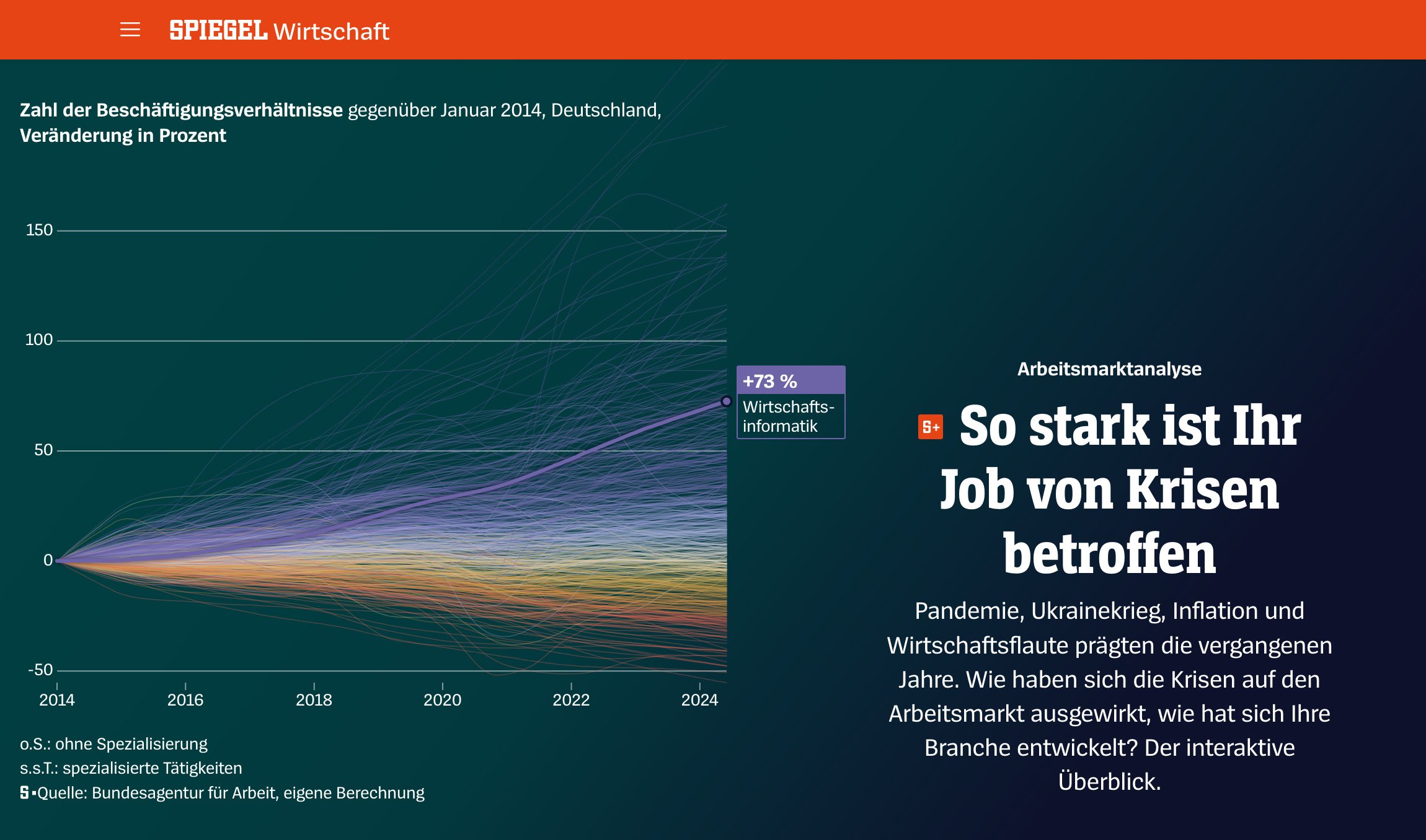
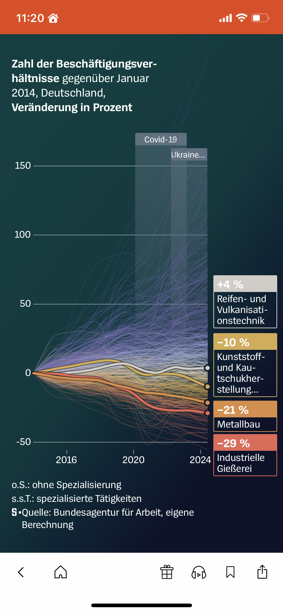
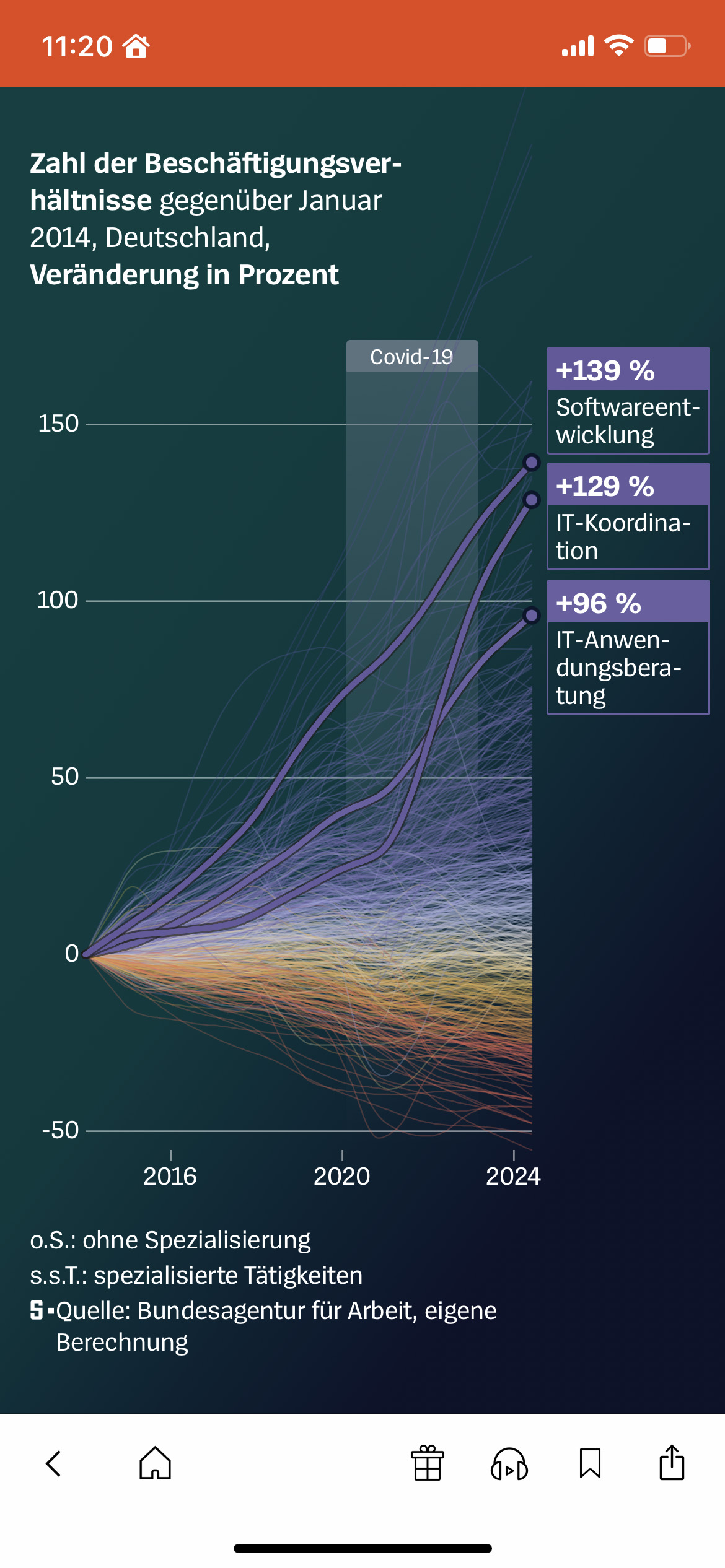
How have the pandemic, the war in Ukraine, inflation, and the resulting economic challenges shaped the German labour market in recent years? To answer this question, I analysed an extensive dataset from the »Bundesagentur für Arbeit« (the German Federal Employment Agency) and visualised the results of our investigation. This resulted in an appealing, interactive storytelling and compelling charts.
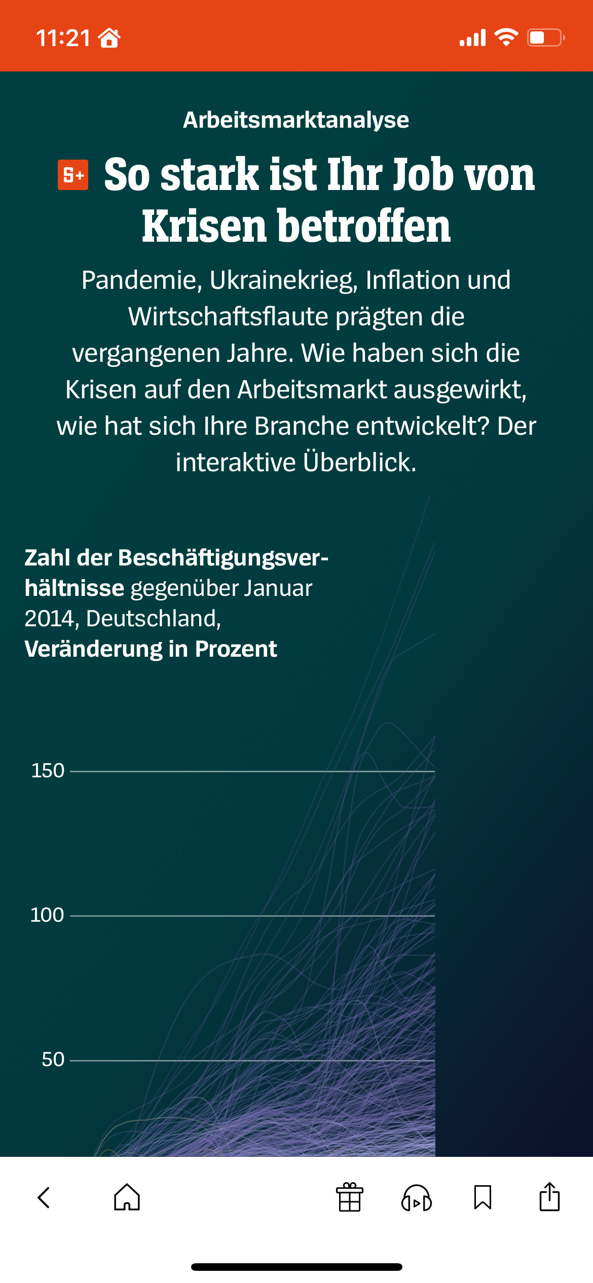
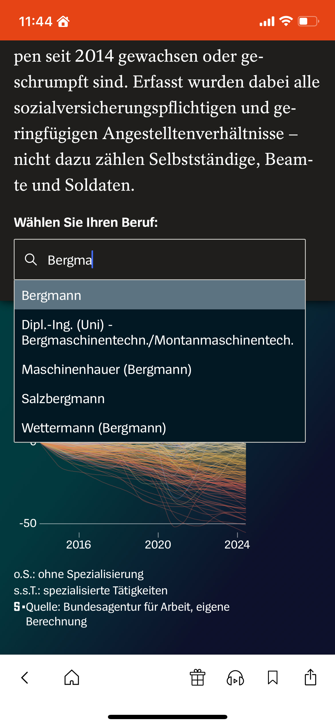
At the beginning of the story, readers can select their own profession. The story references this selection throughout the course of the analysis. If you are not logged in as a subscriber, you will be asked to subscribe in order to use this interactive feature.
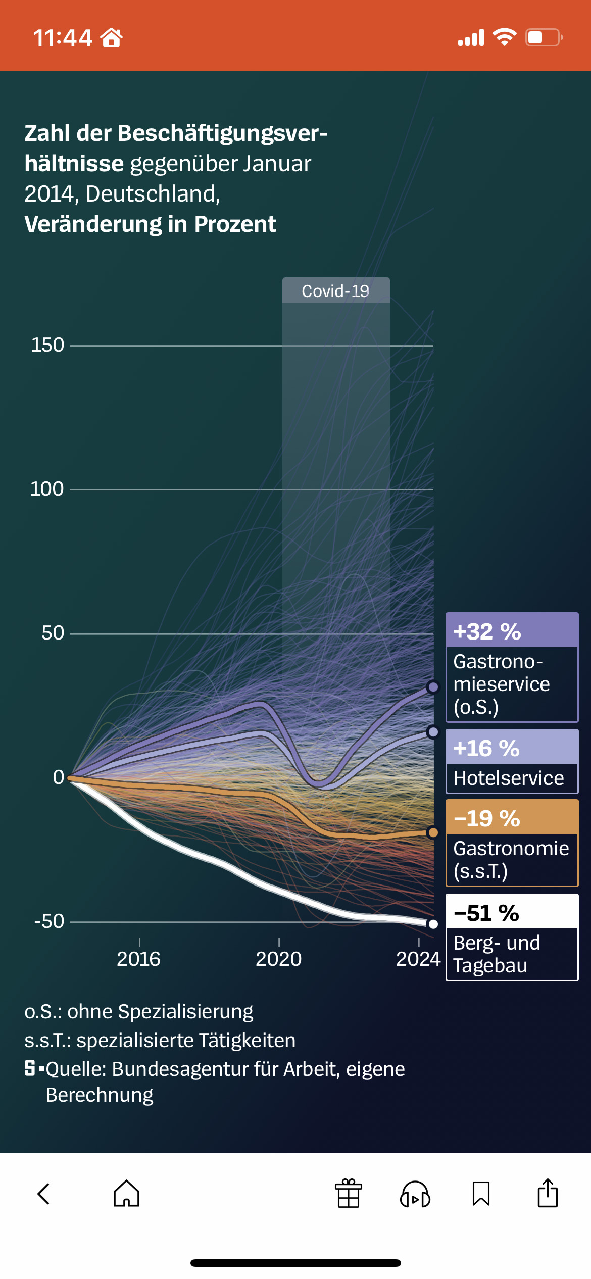
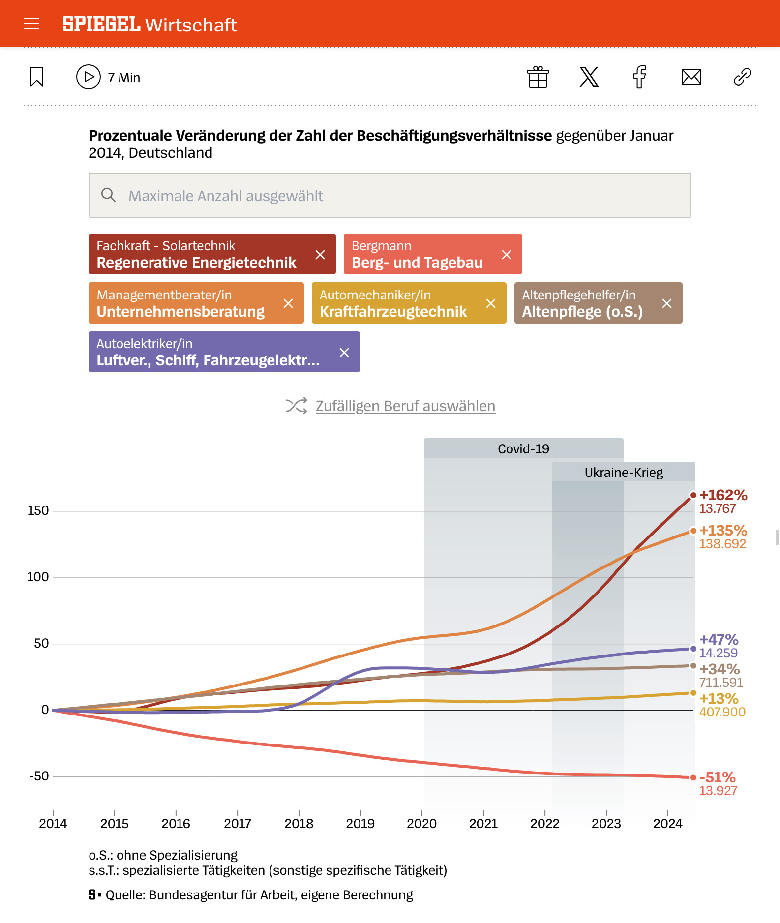
Once I had finalised the concept for the story, I was responsible for the data analysis. After that, I designed the visualisations, developed the storytelling concept did the copywriting. A colleague coded the scrollytelling, while I wrote the code for the interactive chart that concludes the analysis. This enables readers to freely explore the dataset by selecting up to six job groups for direct comparison.
See it live
- »How did crises affect your job?« (paywalled) – published at »Der Spiegel« on January 30, 2025